As the Doom franchise continues to evolve with modern entries like Doom: The Dark Ages, a fascinating conversation has reignited among the community. While the 2025 prequel has smashed records with over three million players, many longtime fans find themselves looking back with a particular fondness for the 2016 reboot's visual identity. It's a testament to the game's lasting impact that, a decade later, its art direction is still held up as the gold standard for capturing the brutal, visceral essence of the series. This isn't just nostalgia; it's a recognition of a specific aesthetic vision that many argue subsequent titles have drifted away from.
The Reboot That Redefined Hell
The 2016 Doom wasn't just a game; it was a resurrection. Originally conceived as a sequel to Doom 3, the project faced a notoriously difficult development cycle before id Software made the bold call to scrap everything and start fresh. This wasn't a simple coat of paint on an old engine. The reboot was a ground-up reimagining, and its visual style was the cornerstone of this new vision. The game presented the UAC facilities and the depths of Hell not with the muted, survival-horror palette of Doom 3, but with a stark, industrial brutality. Environments were massive, gore was visceral and chunky, and the lighting painted every scene in harsh, contrasting tones of gunmetal gray, arterial red, and demonic orange. It felt less like a haunted house and more like a catastrophic industrial accident at a portal to the underworld.
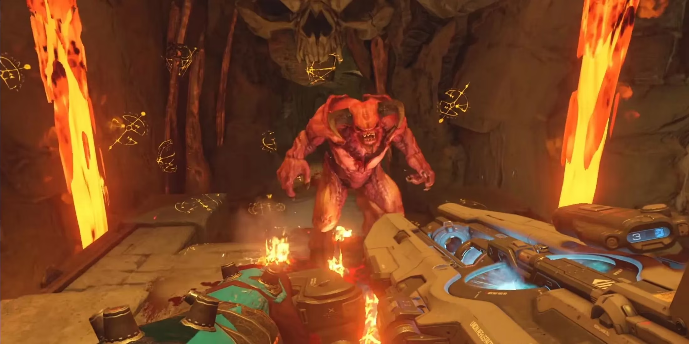
This aesthetic wasn't just for show. As noted by fans like Reddit user Whole_Turnip_6065, the "eerie and gory visuals perfectly reflect the franchise's identity." The 2016 art style served the gameplay like a perfectly balanced weapon. The environments, while detailed, were designed for clarity. You could always spot an enemy, a pick-up, or a path forward. The visual noise was intentional, a cacophony of metal, flesh, and fire that never obscured the core loop of movement and combat. It was a masterclass in functional art direction, where every blood splatter and shattered skull felt like a direct consequence of the player's actions.
The Modern Shift: A Stylistic Crossroads
Fast forward to 2026, and the landscape has changed. Doom Eternal and Doom: The Dark Ages are critical and commercial successes, but they represent a clear evolution—or, as some fans see it, a deviation—in artistic philosophy.
-
Doom Eternal (2020): Leaned into a more exaggerated, almost comic-book aesthetic. The colors were brighter, the architecture more fantastical and vertical, and the demons took on a more cartoonish, exaggerated menace. It was a style that screamed high-octane, arcade-style action.
-
Doom: The Dark Ages (2025): Marketed as a "faithful prequel," it promised a return to roots. Yet, its need to modernize gameplay created a unique visual tension. To accommodate complex new mechanics like enhanced dodging and parrying, the game heavily implemented color-coded enemy tells and environmental cues.
This is where the fan debate crystallizes. For supporters of the 2016 style, these modern concessions create a visual dissonance. The world of The Dark Ages, while gritty, can feel like it's being pulled in two directions: one foot in the grim, grounded (relatively speaking) hellscape of 2016, and the other in the high-fantasy, game-mechanics-first world of Eternal. The color cues, while arguably necessary for playability, act like neon safety signs in a medieval dungeon, breaking the immersive, oppressive atmosphere that 2016 cultivated so well. The art style becomes a servant to complex mechanics, rather than the mechanics emerging naturally from the art style.
The Uncommon Metaphors of Mayhem
Trying to articulate why the 2016 aesthetic resonates so deeply leads to some vivid comparisons from the community. One fan described the shift as moving from a "brutalist architecture textbook come to life" to a "heavy metal album cover designed by a committee." The 2016 art had a singular, oppressive coherence, like a single, punishing symphony. The newer titles, while incredible in their own right, can feel more like a genre-spanning playlist—thrilling, but without that singular, focused tone.
Another apt, if unusual, metaphor is that Doom 2016's visuals are like a "precision-engineered industrial shredder." It's ugly, violent, terrifyingly efficient, and every part of its design has a clear, brutal purpose. Later entries might be more versatile or flashy—like a multi-tool with laser sights—but they lack the terrifying, singular focus of the machine built for one job: rending demonic flesh.
Legacy and The Future of Hell
The current discourse isn't about declaring any game "bad." Doom: The Dark Ages is a triumph, proving the franchise's enduring appeal with its record-breaking launch. The discussions are more nuanced, centering on artistic identity. Fans acknowledge that the color-cue system in the 2025 title likely saved it from being "nearly unplayable" given its mechanical depth. The hope, however, is for a future where id Software can weave that necessary gameplay clarity back into a world that feels as coherent and immersive as the 2016 reboot.
In the eyes of a significant portion of the fanbase, Doom (2016) achieved a near-perfect alchemy. It took the core, pulsating id of the original 1990s games—the speed, the violence, the heavy metal spirit—and translated it into a modern visual language without dilution. It was a reboot that understood the assignment wasn't just to look good, but to feel like Doom. As the series marches forward into new eras and gameplay innovations, the 2016 installment stands as a stark, gore-soaked monument—a reminder that sometimes, the most perfect version of hell is the one that feels the most real, the most brutal, and the most singular in its terrifying vision.
Evaluations have been published by OpenCritic, and looking across aggregated critical consensus helps contextualize why Doom (2016)’s art direction still dominates fan discussions: reviewers frequently single out its readable combat spaces, harsh industrial lighting, and grounded gore as elements that reinforce pacing and immersion rather than competing with mechanics-driven visual cues.
Comms Channel